Best Practices for Website SEO and Accessibility
Rank within a search engine’s first page results by providing valuable content and making sure search engine algorithms understand your intent
Technical conferences bring computing researchers together to learn, share, and make meaningful connections with other professionals in their field.
Because conferences play a significant role in disseminating research, organizers benefit from leveraging multiple channels to promote their conferences. Web searches, advertising, and word of mouth are just a few ways to discover new conferences.
Next to word of mouth, one of the most powerful ways to reach prospective conference attendees is through search engine optimization, also known as SEO.
Google is the most popular search engine, processing 3.5 billion daily searches.
Below, we share actionable tips for conference organizers and website managers that will:
- Cost-effectively reach more conference attendees;
- Create a smooth, intuitive user experience;
- Help search engines understand what your site is about;
- And, contribute to increased conference attendance!
What is search engine optimization (SEO)?
Search engine optimization, often referred to by its acronym, SEO, is the process of improving a website to increase its visibility and position within search engine results. Core components of good SEO include site structure, metadata, on-page content (including text, images, and videos), and page linking.
Why is SEO important for technical conference websites?
The goal of a technical conference is to share the latest research and build relationships. For both to happen, there needs to be attendees. SEO works to organically make your website visible to researchers, students, and companies searching for conferences in their discipline. Additionally, SEO considers the overall needs of your audience (i.e. attendees) and the relative ease of finding the information they are looking for once they arrive at your website.
Structuring a Conference Website
Good website structure not only helps Google understand what your site is about, but it also acts as a map, guiding conference attendees to topically related information. If you find yourself unsure of where to begin or need some advice, The IEEE Computer Society offers marketing support for conference organizers.
Navigation
Best practices:
- Site hierarchy should not exceed three pages deep
- Home Page, Category, Sub-Category
- Note: It is common practice not to include “Home” in the menu, and instead use the conference logo to link back to the home page.
- Group content topically
- Keep navigation menus succinct, and try not to exceed more than seven items.
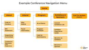
Example Navigation Menu:
- Home
- About (Category)
- Code of Conduct (Sub-Category)
- EDI Statement
- Organizing Committee
- Conference Sponsors (AKA supporters)
- Attend
- Why attend
- Travel information
- Program
- At-a-Glance
- Program Schedule
- Calls for Submissions
- Exhibitors and Sponsors
- Current Exhibitors List
- Exhibitor Experience Guide
- Become an Exhibitor
- Become a Sponsor
- Call To Action – Register
- This button should stand out with contrasting color
URLs
URLs are the first and simplest way for users and search engines to know about the purpose and contents of a page. Keep them descriptive and concise.
Best Practices
- URLs should not be longer than 60-70 characters.
- Should follow a clear path as mentioned above: homepage, category, sub-category
- Example: www.conference.com/program/keynote
- URLs should be evergreen, avoid using dates (e.g. 2022)
- Note: It is okay to update page content every year, but the URL should remain the same because search engines are looking for established URLs.
- Incorporate keywords in your URLs
- Example: www.conference.com/program/ethics-in-ai-panel
Call to Action (CTA)
A Call to Action, also known as a CTA, is often a button that is in a bright, contrasting color that draws the user’s attention. Conference websites share common goals, including providing information and turning page views into attendees.
A CTA will draw the attention of a user on the page to take action.
Best Practices:
- Use a contrasting color from your website’s main color.
- Text should be short and concise.
- Use action verbs
- Examples: Register Now, Save My Seat
- Include in the main navigation menu
- Use first-person voice
Meta Data
Meta data is extra information that gives your potential readers insight into what the page is about. This consists of two main parts: page title and page description (i.e. meta description).
Best Practices:
- Page Title
- Should be between 50-60 characters
- The page title also displays in the tab of a browser
- Example: Keynote Speakers | IEEE Conference Title
- Meta description
- Should be between 150-160 characters
- Should include keywords used in the title and highlight what visitors are about to read.
- Example: IEEE Conference 2022 keynote speaker lineup includes 20 experts in [conference topic] on 22-23 September in Aurora, Colorado.
Page Layout
After you get your metadata squared away, it’s time to structure the page’s content. It’s best to remember visitors to your page are looking for a smooth and easy experience. The best way to do this is to provide them with short and concise text. Additionally, these short bodies of text can be further organized with headers and, when possible, summarized with bullets.
Best Practices
- Each page should only have one H1 tag that is used for the page title.
- An H2 header should be used to organize large sections of information
- H3 headers should be used for sub-sections of an H2
- Note: to meet ADA compliance, paragraph text should be at least 16-18px.
- Images, videos, links, and graphics should all contain an alt tag to give screen readers more information.
- Example (HTML):
<a href="”www.conference.com”">IEEE Conference</a>
- Example (HTML):
Page Structure and Contents
Best Practices:
- Each page should only have one H1 tag that is used for the page title.
- An H2 header should be used to organize large sections of information.
- H3 headers should be used for sub-sections of an H2.
- To meet ADA compliance, paragraph text should be at least 16-18px.
Graphics on a Page
A ranking factor for websites and individual pages is the user experience. A page’s load speed contributes to user experience and can be slowed down by large image files. Additionally, all images, videos, links, and other graphics should include an alt tag to give more information to screen readers.
Best Practices
- File type: jpg, webp
- File size: 200-300 KB
- Max width: 1,500px
- Max height: 1,000px
- Note: listed above are max width and height; aim for smaller-sized graphics to accommodate different screen sizes.
- Images, videos, links, and graphics should all contain an alt tag to give screen readers more information.
- Example (HTML):
<a href="”www.conference.com”">IEEE Conference</a>
- Example (HTML):
ADA Compliance and Accessibility
A ranking factor for websites and individual pages is the user experience. A page’s load speed contributes to user experience and can be slowed down by large image files. Additionally, all images, videos, links, and other graphics should include an alt tag to give more information to screen readers.
Best Practices
- File type: jpg, webp
- File size: 200-300 KB
- Max width: 1,500px
- Max height: 1,000px
- Note: listed above are max width and height; aim for smaller-sized graphics to accommodate different screen sizes.
- Images, videos, links, and graphics should all contain an alt tag to give screen readers more information.
- Example (HTML):
<a href="www.conference.com">IEEE Conference</a>
- Example (HTML):
Accessibility for Emails
Visuals
- Use color thoughtfully – don’t rely on color alone to convey your message.
- Avoid flashing links or gifs
- Use responsive design to ensure message can be ready on all devices
Text
- Use clear, descriptive subject lines
- Write readable copy: ensure your copy can be easily read and understood by a broad audience
- Check your font, text size and spacing for readability
Backend
- Use semantic tags such as:
<summary>,<figcaption>,<time>,<footer>to provide screen readers more information - Use role=”presentation” on presentational tables
- Tag your images with alt text
Testing
- Check your emails with images on and off, is your message still intact?
- Use the Flesch-Kincaid Reading Ease test to measure readability
- Check if minimum contrast ratio of 4.5.1 is met with Color Contrast Accessibility Validator
Inbound Links
Inbound links are links from other websites that direct people to your website. This gives your conference website visibility, and it sends positive signals to search engines that your website is authoritative.
Best Practices
- Inbound links can come from press releases, a blog article on computer.org, social media posts, and even pages owned by sponsors or keynote speakers.
- Make sure these are “do-follow” links to give your website credit from the linking website
Resources
Optimizing a website for SEO is an ongoing process. Below are a few resources to improve your website and learn more about SEO.
- Search Engine Optimization (SEO) Starter Guide by Google
- 9 SEO Best Practices by SEMRush
- Organize a Conference with the IEEE Computer Society
- Best Practices for Conferences
- Tips for making your conference more LGBTQ+ inclusive
Need help getting started? Request a CS hosted website template for your conference today. Contact your event planner for details.
